Tips Menghasilkan Uang dari Digital Marketing Automatisasi AI

Menjelajahi Masa Depan di Era Artificial Intelligence Selamat datang di All About Internet! Dunia sedang berubah dengan sangat cepat. Kehadiran Artificial Intelligence (AI) bukan lagi sekadar bumbu film fiksi ilmiah, melainkan alat yang mendefinisikan ulang cara kita bekerja, berkarya, dan berinteraksi setiap hari.


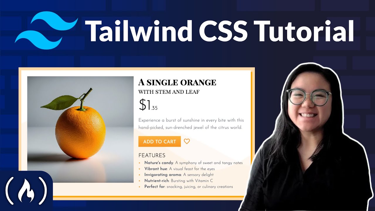
Tailwind CSS has transformed the way developers approach web design with its utility-first methodology. This innovative framework enables rapid build and styling directly in HTML with a focus on efficiency. In this guide, we'll explore how to create a visually stunning, fully responsive product card using Tailwind CSS – a vital skill for modern web developers, especially those venturing into e-commerce web design.
Tailwind CSS stands out from traditional CSS frameworks by emphasizing utility classes, allowing developers to apply styles directly in HTML without the need for extensive CSS files. Here’s why learning Tailwind CSS can elevate your web development skills:
In this course, presented by Rachel Johnson from Scrimba, you will not only learn the basics of Tailwind CSS but also delve into more advanced features tailored for an e-commerce application.
Here's a closer look at what you'll be covering throughout the course:
Start by creating a basic HTML file and include the Tailwind CSS CDN link in the head section. You may also want to link a custom CSS file to manage additional styles if necessary.
<link href="https://cdn.jsdelivr.net/npm/tailwindcss@2.2.19/dist/tailwind.min.css" rel="stylesheet">
Next, create a simple HTML structure to represent your product card. Here's an example:
<div class="max-w-md mx-auto bg-white shadow-md rounded-lg">
    <img src="your-image.jpg" alt="Product Image" class="w-full h-48 object-cover rounded-t-lg">
    <div class="p-6">
        <h1 class="text-2xl font-bold mb-2">Product Title</h1>
        <p class="text-gray-500 mb-4">Short description of the product goes here.</p>
        <p class="text-xl font-semibold text-orange-600">$39.99</p>
        <button class="w-full bg-gradient-to-b from-light-orange to-orange text-white py-2 mt-4 rounded-lg">Add to Cart</button>
    </div>
</div>
To customize Tailwind’s default options such as colors or fonts to align with your design mockups, you’ll need to modify the tailwind.config.js file. Here’s how to set it up:
module.exports = {
  theme: {
    extend: {
      colors: {
        "light-orange": '#FFE1B2',
        "orange": '#FF9A00',
      },
      fontFamily: {
        customFont: ['Roboto', 'sans-serif'],
      },
    },
  },
  variants: {},
  plugins: [],
}
This configuration allows you to use bg-light-orange and bg-orange as utility classes in your HTML.
Once the setup is complete, it’s time to style the product card. Here’s how to use Tailwind utilities to create a sleek and appealing design:
mx-auto utility.bg-white and rounded-lg.shadow-md.w-full h-48 object-cover to ensure the image is responsive and fits neatly within the card.To ensure your product card is responsive, leverage Tailwind's mobile-first design approach. For instance, use responsive utilities like md:hidden or md:flex to manage visibility of elements at different screen sizes without writing custom media queries.
Add interactivity to your product card through Tailwind’s transform and transition utilities. For instance, you can make buttons and images scale on hover:
<button class="bg-orange-600 text-white py-2 px-4 rounded hover:scale-105 transition-transform duration-200">Add to Cart</button>
By the end of this course, you will have the skills to create a fully responsive product card optimized for e-commerce, leveraging Tailwind CSS’s robust features. With practice, you can apply these concepts to various web design projects, enhancing both aesthetic appeal and functionality. Tailwind CSS not only streamlines your code but prepares you for industry-standard web design practices.
Explore the Tailwind CSS documentation further for advanced techniques, and start building exceptional user interfaces today! Happy coding!
Comments
Post a Comment